I’m focusing on saving an “imperfect” photo. We all have them! (I work with Photoshop CS3, I’m not sure if this will work with Photoshop Elements.)
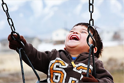
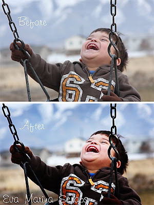
This is what my picture looked like straight out of the camera. It was really overcast so the color is a little washed out. Also, he was in a moving swing and I was shooting with Auto-Focus… as you can see the camera focused on the swing’s chains which left my son looking blurry. Look at that smile though… I had to save this picture!
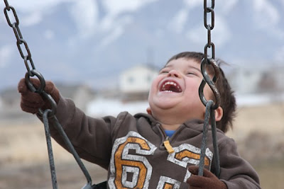
The first thing you want to do is copy your picture. Take it from me- the last thing you want to do is accidentally save over your original file. Working with your copy, duplicate your photo layer two times and change the blending mode on both layers to “Soft Light”. This will increase the contrast in the photo and brighten up the colors.
TIP: You can easily duplicate a layer by using the shortcut Ctrl+J or simply go to Image in your toolbar and choose Duplicate from the dropdown menu.
Choose the top layer and duplicate it one time. Change the blending mode of this new layer to “Screen”. This will lighten up your photo quite a bit. At this point your photo will look a little something like this, don’t worry it won’t stay this way for long.
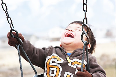
You will now have four layers in this order:
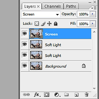
Working with your top layer, which is in “Screen” mode, lower the opacity until you are happy with the results. Every photo is different, but for this photo I lowered the opacity to 20%.
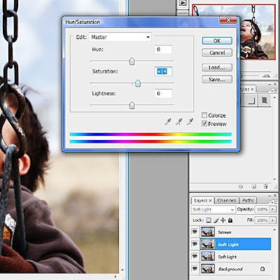
Now, select your third layer which is in “Soft Light” mode. We are going to adjust the saturation just a bit. You can bring up your dialog box by using the shortcut Ctrl+U or go to Image in your toolbar, then select Adjustments from the dropdown menu and finally Hue/Saturation. Leave the Hue alone, you risk ending up with unnatural colors otherwise. Adjust your Saturation slider until you are happy with the results, remember to keep things natural. For my photo I changed the Saturation to +14.
At this point my photo looks like this. It’s better, but still a little washed out and still obviously blurry.
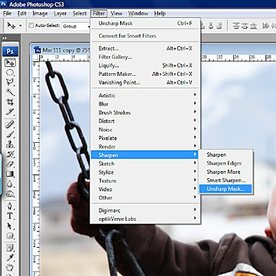
Ok, now let’s see what we can do to sharpen it a little. Select your original photo layer. Go to “Filter” in your toolbar, select “Sharpen” from the dropdown menu then select “Unsharp Mask”.
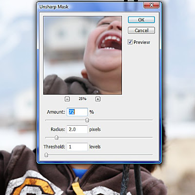
Use caution whenever you sharpen a photo. Sharpening darkens your photo and if you overdo it your picture will look grainy. I used the following settings for my photo- Amount: 72%, Radius: 2 pixels and Threshold: 1 level.
Flatten your image. We have just a few more tweaks. In my opinion the color in the photo is still too washed out. Also, I would really like to draw more attention to his face and away from that extra crisp and sharp chain.
Working with your flatted photo, duplicate it one time and change the blending mode of this new layer to “Multiply” mode. The color has improved, but it is too dark and we’ve lost some detail in the darker parts of the photo. Select the “Elliptical Marquee” tool and feather it in your toolbar, this will help it blend better. The larger the photo, the more you should feather it. My camera is 10 MP, I almost always feather 200 pixels.
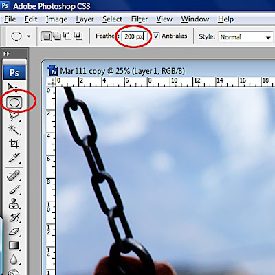
Working on the top layer in “Multiply Mode” and with your “Elliptical Marquee” tool active, select the area of your photo that you would like to draw more attention to. In my case I chose his face.
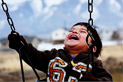
Delete the selected area. Now lower the opacity of the layer until it looks natural and the area of the layer you deleted blends naturally. I lowered mine to 65%, but if it were a darker photo I would probably go as low as 30-40%. If there are any dark areas in your photo that lost too much detail now is the time to adjust it. I like to use the eraser at about 50% opacity with a very soft round brush to lighten these parts of the photo. Only use the eraser tool on your top layer. Do not erase your background photo layer. I chose to lighten his right hand.
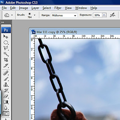
Flatten your image. If you are satisfied with your results, save your picture and you are done. I wanted to darken the edges a little. I chose to use the “Burn” tool. I wanted the effect to be subtle. I used a big and soft round brush set at 10% Exposure and chose Midtones for the Range.
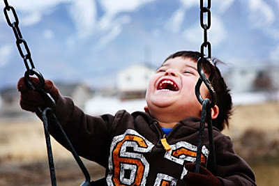
Here is my final picture.
Here are the before and after pictures together… not too shabby, hey?
I hope you found this tutorial helpful. I'd like to post more tutorials in the future, but that probably won't be until the weather starts to cool down a bit. Having too much fun outside right now...
Happy Scrapping!


No comments:
Post a Comment